We all love a good personality test. Whether it’s something serious like the Big Five or just a fun quiz you found online, these tests promise to tell us a little more about who we are. But here’s the thing—once you’ve clicked through all the questions and get your results, sometimes it looks like a wall of text or a bunch of numbers. Not exactly inspiring, right? That’s where the personality test bar graph saves the day.
Why personality tests are everywhere
Let’s face it, people are obsessed with figuring themselves out. It’s why quizzes go viral on social media and why companies use assessments when hiring. Some of the big names you’ve probably heard of include:
-
The Myers-Briggs (yep, the one that calls you an ENFP or INTJ).
-
The Big Five (which is more science-backed and measures traits like openness and extraversion).
-
DISC tests (popular in workplaces for team building).
All of them basically try to answer the same big question: who are you, really? And while words and descriptions are nice, most of us just want something visual and easy to get. That’s where graphs come in.
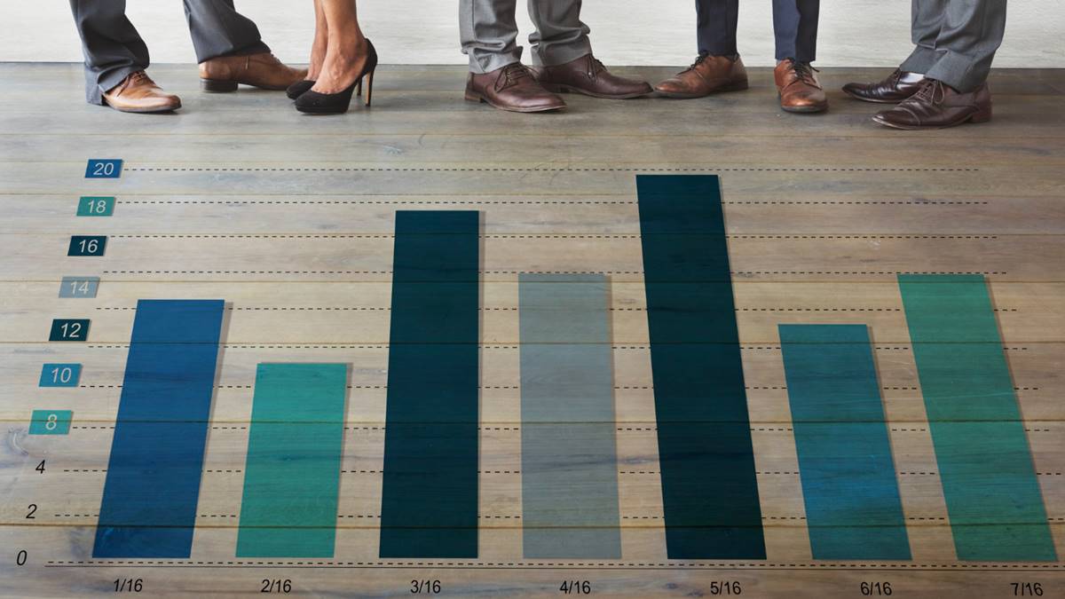
What exactly is a personality test bar graph?
Picture this: instead of scrolling through paragraphs of explanation, you get a neat chart with bars showing how much of each trait you scored. One bar might show your “extraversion,” another might be “agreeableness,” and so on. The longer the bar, the higher your score.
It’s like a quick personality snapshot. You don’t need a psychology degree to get it—you just look, compare the lengths, and boom, you’ve got a sense of your strongest traits.
Why graphs make everything easier
There’s a reason bar graphs work so well for personality tests:
-
They’re fast: one glance tells you more than a page of text.
-
They’re visual: humans are wired to understand pictures better than numbers.
-
They’re comparative: you can instantly see which traits are higher or lower.
-
They’re memorable: chances are, you’ll remember “my extraversion bar was off the charts” more than a paragraph description.
Basically, they turn complicated data into something your brain can actually use.
How different tests use bar graphs
Depending on the test, your graph might look a little different. For example:
-
Big Five tests usually show five bars: Openness, Conscientiousness, Extraversion, Agreeableness, and Neuroticism.
-
DISC tests have four bars: Dominance, Influence, Steadiness, and Conscientiousness.
-
Emotional intelligence tests might break it down into empathy, self-control, motivation, and so on.
Some even get fancy with colors and shading, but the idea is always the same—turning your answers into a visual you can instantly understand.
How to actually read your results
Okay, so you’ve got your shiny new personality test bar graph in front of you. What now? Here are a few things to look at:
-
Which bars are longest? These are usually your “defining” traits.
-
Any really short bars? That doesn’t mean something’s wrong with you, but it might explain what drains your energy.
-
How balanced is the graph? Some people have one or two dominant traits, while others are more evenly spread out. Neither is good or bad—it just shows different styles.
The trick is not to overthink it. Use it as a guide, not a strict label.
The fun (and the limits) of bar graphs
The cool part about a personality test bar graph is how much easier it makes understanding yourself. But like anything, it’s not perfect.
-
It simplifies things—maybe a little too much. People are complicated, and no graph will capture every detail.
-
It can feel too precise—like if your “openness” bar is at 63%, does that really mean something exact? Not really.
-
It’s still based on self-reporting—meaning the answers depend on how honest (or self-aware) you were when filling it out.
So yeah, graphs are great, but don’t treat them like your life’s blueprint.
Why people love sharing them
One big reason bar graphs are so popular is because they’re social-media friendly. Instead of posting a long essay about your personality type, you can just share a screenshot of your colorful bars. Friends get it instantly, and you might even start fun debates like: “Wow, I thought you’d be way more agreeable!”
Workplaces also love them because they make team differences easier to explain. A manager can literally point at a graph and say, “See? That’s why you two approach projects so differently.”
Looking ahead: graphs 2.0
As personality testing moves online, graphs are getting even more interactive. Some platforms now give you dashboards where you can hover over a bar to see detailed explanations, or compare your graph to someone else’s. AI is even being used to suggest careers, habits, or communication tips based on your chart.
But even as tech gets fancier, the good old bar graph isn’t going anywhere. It’s just too simple and effective to replace.
Final thought
At the end of the day, a personality test bar graph is just a tool—a way to take all those quiz answers and put them into a shape your brain can actually process. It’s quick, it’s visual, and it makes understanding yourself a little more fun.
So the next time you get your results, don’t just skim past the graph. Take a good look. Those little bars might not hold the ultimate truth about who you are, but they can give you some pretty cool insights—and maybe even spark a conversation or two.